


Project Overview
The product:
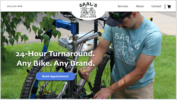
Saal’s Bike Repair is a small business owned by my brother, Nicholas Saal. Saal’s Bike Repair offers all sorts of bike repairs such as tune-ups, truing, alignment, and more. This Responsive Web Design enables users to book appointments to drop off their bikes easily on their mobile device or desktop computer. Saal’s Bike Repair’s goal is to get people back on their bikes as fast as possible - first by creating a website easy to use for all users.
Project duration:
June 2022 to August 2022

The problem:
Users used to have to call the shop to book an appointment. This wastes time for the users and for the business owner. Talking price, specifications, and bike work over the phone can be a hassle.
The goal:
Design a Saal’s Bike Repair website to be user-friendly by providing clear navigation and offering a hassle-free way to book an appointment for bike repair.
My role:
UX designer leading the Saal’s Bike Repair website design.
Also photographer for all the websites images.
Responsibilities:
Conducting interviews, paper and digital wireframing, low and high-fidelity prototyping, conducting usability studies, accounting for accessibility, iterating on designs and responsive design.
User Research
Summary:
I conducted user interviews, which then turned into empathy maps to better understand the target user and their needs. I discovered that many target users want their bikes in and out the shop quickly as they have busy lives and families. However, many bike repair websites are not offering appointment booking and are confusing to navigate, which frustrated many target users. This caused an experience that should be seamless to become challenging and wastes time for the users.

Pain points:
Persona:
Nick is a busy recent college graduate who needs to submit his bike repair online since he has a busy schedule and does not have time to call and hassle with talking to customer service.

Sight Map:
Difficulty with website navigation was a primary pain point for users, so I used that knowledge to create a sitemap.
My goal here was to make a strategic information architecture decisions that would improve overall website navigation. The structure I chose was designed to make things simple and easy.

Starting the Design
Paper wireframes:
Next, I sketched out paper wireframes for each screen in my app, keeping user pain points about features, experience, and navigation in mind.

Paper wireframe screen size variations:
Because Saal’s Bike Repair customers access the site on a variety of different devices, I started to work on designs for additional screen sizes to make sure the site would be fully responsive.
The home screen paper wireframe variations to the left focus on optimizing the navigation experience for the users.


Stars were used to mark the elements of each sketch that would be used in the initial digital wireframes.

Refined paper wireframe.

Digital wireframes:
Moving from paper to digital wireframes made it easy to understand how the redesign could help address user pain points and improve the user experience.
Prioritizing useful button locations and visual element placement on the home page was a key part of my strategy.


Digital wireframe screen size variations:


Low-fidelity prototype:
To create a low-fidelity prototype, I connected all of the screens involved in the primary user flow of adding an item to the cart and checking out.

View Saal’s Bike Repair low-fildelity prototype
Usability study: parameters
Study type: Moderated usability study
Participants: 5 participants
Location: Saint Paul, MN & Rosemount, MN
Length: 20-30 minutes
Usability study: findings
These were the main findings uncovered by the usability study:

Mockups
Based on the insights from the usability study, I made changes to improve the site’s checkout information. One of them was to add that notes section. This allowing users to now share any additional information that they want to about their bike.


Before usability study
After usability study
To give the users options of payment, I added a pay now or may after option in the checkout section. I found that some customers want the payment out of the way first and want to pay upfront, while others want to see what work was done on their bike before they pay.


Before usability study
After usability study
Mockups: Original screen size


Mockups: Screen size variations
I included considerations for additional screen sizes in my mockups based on my earlier wireframes. Because users shop from variety of devices, I felt it was important for a range of device sizes, such as mobile and desktop so users have the smoothest experience possible.


High-fidelity prototype:
My hi-fi prototype followed the same user flow as the lo-fi prototype and included the design changes made after the usability study.
View the Saal’s Bike Repair high-fidelity prototype

Accessibility considerations:

Takeaways
Impact:
Our target users shared that the design was intuitive to navigate through, more engaging with the images, and demonstrated a clear visual hierarchy.
What I learned:
I learned that even a small design change can have a huge impact on the user experience. The biggest take away for me is to always focus on the real needs of the user when coming up with new design ideas and solutions.
Next steps:
Conduct follow-up usability testing on the new website
2. Identify any additional areas of need and ideate on new features
Let’s connect!
Thank you for reviewing my work on the Saal’s Bike Repair website!
If you’d like to see more, or get in touch, my contact information is provided here.
3. Hand off to my brother to develop and make it into a real website for him to use!
Tools used:
Adobe XD & W3C Web Content Accessibility Guidelines