
Google UX Certification Project
Project Overview
The product:
I created a new app to help users order food from a pasta food truck company called Travioli Ravioli.
My role:
UX designer & UX researcher for Travioli Ravioli from concept to delivery.
Responsibilities:
Conducting interviews, paper and digital wireframing, low and high-fidelity prototyping, conducting usability studies, accounting for accessibility, and iterating on designs.
Project duration:
February 2022 to June 2022
The problem:
Users are having to get up from their tables to go to food trucks and they are losing their tables. This is wasting time waiting in line to order and receive their food when they want to be chatting with friends/family.
The goal:
Create an enjoyable and useful app that solves all of these problems and makes them want to come back for more.
Understanding the user - User Research
Summary
I conducted interviews and created empathy maps to understand the users I’m designing for and to meet their needs and wants. A primary user group identified through research was working adults and busy college students that have limited free time.
This user group confirmed some initial assumptions about Travioli Ravioli customers, but research also revealed that limited free time was not the only their key challenge. Other user problems included wasting time by waiting in lines, losing their table to get their food, resulting in simply cutting out time to chat with their friends and family while being out.
Persona: Winston
Problem statement:
Winston is a social college student who needs a way to order food from his table he is sitting at because he wants to sit and chat with his friends without losing the table.

Story board - Close up
How can we solve the losing table problem?
Users will scan a QR code which is placed on a numbered table. The web app of Travioli Ravioli then pulls up from their specified web browser.
Starting the Design
1. Paper wireframes:
Taking the time to draft iterations of each screen of the app onto paper ensured that the elements that made it to digital wireframes would be well-suited to address user pain points. For the home screen, I added a quick slide-up to view the menu and a basket viewing feature to help users save time.
*Highlighted marks were used to make the elements of each sketch that would be used in the initial digital wireframes.

Using a camera scanning feature for payment was a key user need to address in the designs in addition to equipping the app to work with assistive technologies.
3. Low-fidelity prototype
The low-fidelity prototype connected the primary user flow of selecting and ordering a pasta dish, so the prototype could be used in a usability study with users.
View the Travioli Ravioli
Pain Points
1. Time: Working adults and students have limited time in the day to spend time with friends and family
2. Typing Info: Users in putting all their information is a hassle and takes time to complete
3. Surveys: A speed bump of the user completing their order slows them down in achieving their goal
4. Too Many Options: Small text with many options can be overwhelming and confusing
User journey map
Mapping Winston’s user journey revealed how helpful it would be for users to have access to a dedicated food truck app.


2. Digital wireframes
As the initial design phase continued, I made sure to base screen designs on feedback from the user research.


4. Findings from the Usability study
I conducted two rounds of usability studies. Findings from the first study helped guide the designs from wireframes to mockups. The second study used a high-fidelity prototype and revealed what aspects of the mockups needed refining.

Refining the design
1. Mockups
Early designs allowed for some customer information but after the usability studies, I added the users Last Name, Email, and Phone Number.
I also revised the design to make the flow more linear.


The second usability study revealed frustration with the actual line the user was on and not noticing the camera icon. I highlighted the line and text to the color of the brand to signify which line the user is on. I also moved the camera icon into the keyboard, which is a natural IOS placement.
Mockups

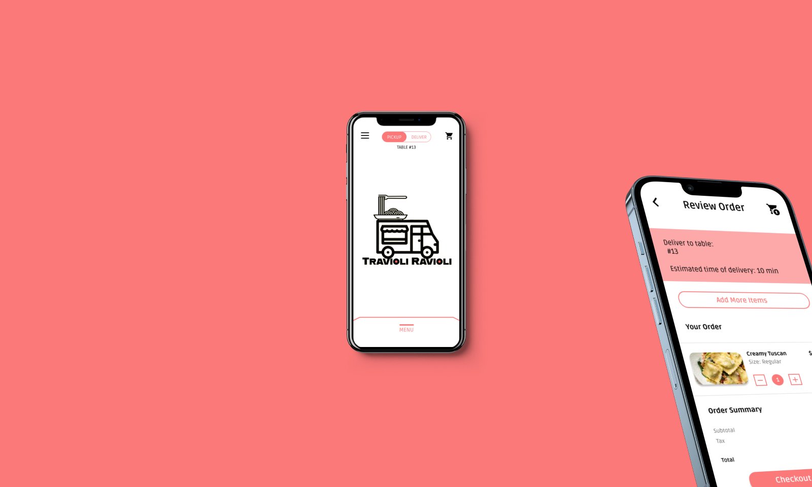
High-fidelity prototype
The final high-fidelity prototype presented cleaner user flows for selecting, ordering and checking out.
It also met users needs for delivery to table option and easy payment methods.
View the Travioli Ravioli high-fidelity prototype.
Accessibility Considerations

Going forward
Next Steps & Takeaways

THANK YOU!
Thank you for your time reviewing my work on the Travioli Ravioli Food Truck app! If you’d like to see more on this project or get in touch, my contact information is provided here.
Impact:
This app makes users feel like Travioli Ravioli cares about meeting their wants, needs, and desires.
One quote from peer feedback:
“The app made it easy, fun, and useful to order food from my table! I would definitely use this app as my go-to for a delicious and timely meal”
What I learned:
While designing the Travioli Ravioli food truck app, I learned that my first ideas are only the beginning of the process and that what really matters are its users. Usability studies and peer feedback influenced every iteration of this app’s design.